As a web designer, we often go for blocks that are more appealing to look at than how functional it is. Did you know focusing on minimal design can also bring beauty to your site? Well, it’s the simple things in life that people appreciate, whether it’s lifestyle or webstyle.
Concept of Minimalism
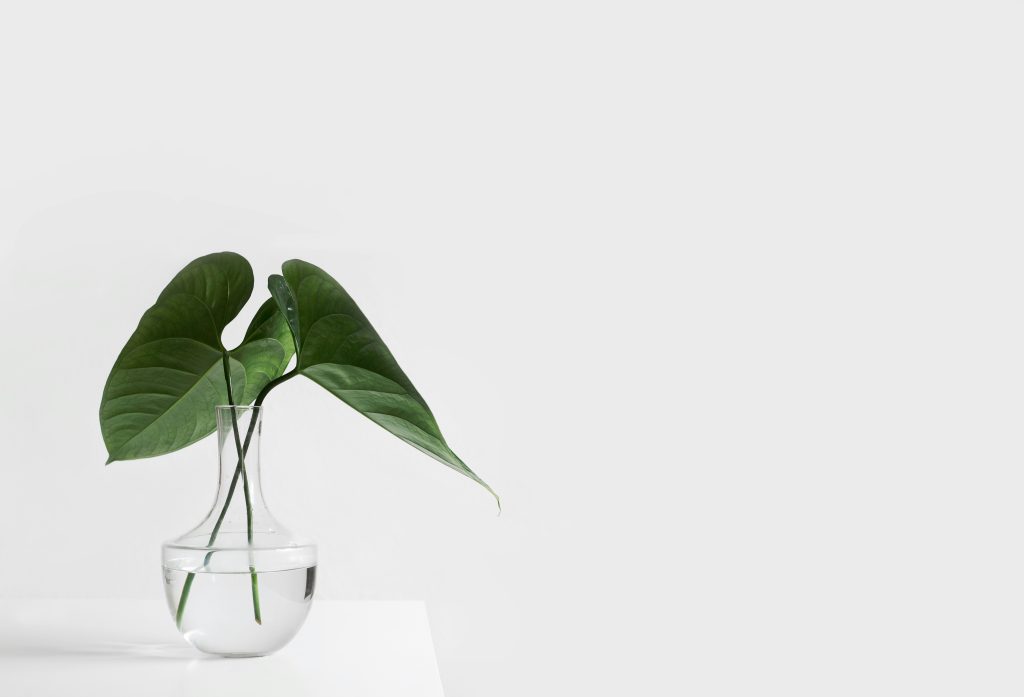
Minimalism as a life philosophy boils down to living a simple life with fewer but carefully selected things, fewer commitments and less noise to, instead, gain more clarity on the things that truly matter, more time, and more calm. It is a design and lifestyle that revolves around simplicity and the elimination of unnecessary elements. It prioritizes quality over quantity, rather than having a lot of features, it focuses on having fewer but higher-quality items.
How can we use Minimalism in our Design?
We can start by removing overcomplicated and unnecessary stuff whose only purpose is to look good. They only slow down your page while also giving you a bad SEO ranking. Try striving for more functionality to get more events on your page.
Next, go for simple color palettes. Stick to a small set of complementary colors, such as white, black, gray, or muted pastels. Limit the use of bright or bold colors. As these colors tend to be strong to users’ eyes and often distract them from the main content on the page.
Benefits
- The simplest ideas often communicate the quickest.
- The most focused solutions are the easiest to build, maintain, and update.
- Simplicity in design can have cheaper implementation and maintenance costs.
- It’s hard to achieve, but once you do, it’s loved by all.
- Simple solutions are more thoughtful and can be used longer.
- Simplicity makes project management easier.
Examples of Minimalistic Websites
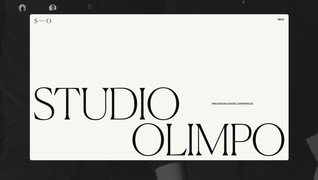

Studio Olimpo is a creative digital studio that focuses on crafting elegant websites with a memorable experience and seamless functionality.
Zaneffi is a Romanian digital solutions provider specializing in designing, developing, and maintaining custom software.
How did they do it?
As you can see, both of these websites are different, but they are both minimalistic. It’s the use of basic and not too crazy fonts and simple colors. They use colors like black, white, and some shades of grey. This keeps the websites simple and follows the trend of being minimalistic.
What to avoid
There are many things that people accidentally do when trying to achieve minimalism. Here are some things to avoid that people misunderstand:
Over-simplyfying Content: Avoid removing essential information or features that your users need. While minimalism focuses on simplicity, it’s important not to strip away critical content that enhances user experience or serves a functional purpose.
Too much white space: Don’t make the design feel “cold” or like it’s lacking purpose. While white space (or negative space) is important in minimalism, too much can make the site feel empty or unfinished. Ensure there’s enough structure and purpose behind the space you leave.
Too little functionality: Avoid removing necessary features or making the website feel too bare-bones. For example, don’t hide important elements like navigation or contact information behind obscure interactions.
Complex Navigation: A minimalist site often requires a simpler, more streamlined navigation system. Too many links or dropdown menus can overwhelm the user.
Poor Readability: Minimalism often involves a lot of white or light-colored backgrounds, but if your text is too faint or hard to read, it will frustrate users.
Conclusion

In conclusion, Minimalism is a concept of keeping things simple in life or design. Minimalism is getting rid of unnecessary things that provide no significant value. It’s about keeping it simple and still being able to function as it’s intended. Not too bold or bright colors, like using simple colors like white, gray, and black. There are mistakes that people make, and they often try to keep things too simple, which is not the point. They make it too empty, making it feel “cold” or unfinished. This is something I recommend starting trying out.